1
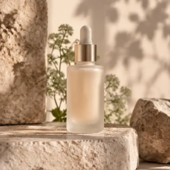
The Hook
Your skin when the cold sets in
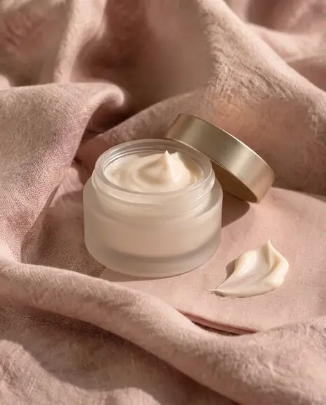
Three gentle steps that keep moisture in all winter.
See the routineThe Splash format is a five-block newsletter layout: the Hook, the Choice, the Stack, the Favorites and the Store. Each block moves readers from first interest toward a clear next step. We reuse the structure with your photos, products and voice, so every send feels familiar without looking the same.
01 · The Hook
The Hook gives readers a reason to stay. One image, a short headline and a clear next action show what this send is about. The most important idea appears before readers start scrolling, rather than after a long greeting.
One main image. A headline rendered as readable text. One primary button. No long introduction before the offer.
The Hook
Three gentle steps that keep moisture in all winter.
See the routine02 · The Choice
The Choice gives readers clear paths to a category or need. It makes a broad store easier to understand without showing the whole catalog. Each choice leads to a page that matches what the reader just saw.
Two or three choices. Short labels. Distinct images. Link to the matching product or category.
03 · The Stack
The Stack shows two products that belong together and makes the next purchase easier to picture. If the pairing reaches the store's real free-shipping threshold, we make that clear. Readers see why the pair matters, not just that more products exist.
Two complementary products. Show the total and real shipping threshold when relevant. Never invent discounts or terms.
The Stack
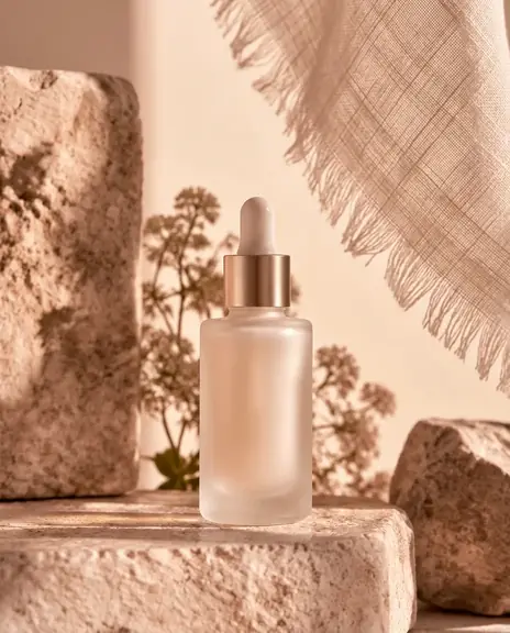
Dew Serum
Night Veil
Together €78. Free shipping from €60.
Add both to cart04 · The Favorites
The Favorites offers a small selection for readers who did not choose the main product. In client sends, we use verified best sellers and real reviews when available. The block should make a decision easier, not turn into a long product catalog.
A small selection with clear product names. Only genuine ratings and reviews. No invented quotes in examples.
The Favorites
05 · The Store
The Store gives readers a clear route onward at the end. Links to new arrivals, the catalog or a useful page serve different needs without competing with the main idea above. It is a deliberate ending, not a wall of unrelated links.
A few useful links. One clear store button. Contact details and unsubscribe in the footer.
The Store
New in
Best sellers
Two minute skin quiz
Long introductions, ten products in a row and three CTAs fighting for attention. A send needs one clear idea, not the store's whole calendar.
No. The structure repeats, but photos, headlines, products and voice adapt to your brand and the idea you want to promote.
Yes. We build and test it directly in your Klaviyo. You get a test send to approve before we schedule it.
Yes. Your sends use your own photos, products and brand identity.
Yes. Send your last two newsletters and we redesign them free within 3 business days, then walk through them in 15 minutes.
We redesign them free within 3 business days and walk through them in 15 minutes. Your photos, your products. No obligation.
Start with a free redesign